Health and Government
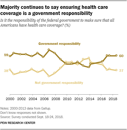
This chart gives information about the number of Americans who believe that Healthcare coverage is the responsibility of the government (from 2000 - 2018). Summarise the information by reporting the main features and making relevant comparisons. (Around 150 words)
-
Sample Answer |
|---|
This graph shows the number of Americans who believe that Healthcare is either a government responsibility, or not the responsibility of the government, over an 18-year period. In the year 2000, 59% of people agreed that Healthcare was the responsibility of the government, compared to 38% who feel that Healthcare is not a government responsibility. In 2007 we can observe a peak where those who regard public health as a government responsibility reach the highest numbers at around 70%. In the same year, those who claim that Healthcare is not a governmental responsibility dropped to its lowest at 20%. Figures reached a par between 2010 and 2012 before opinions on Healthcare changed in the following years. In 2018, figures have returned to almost the same numbers as in the year 2000, with six in ten of the opinion that medical care is the obligation of the government. Four-tenths of those asked disagreed. |
-
Analysis |
|---|
COHERENCE AND COHESION The answer opens with a description of the chart (“This graph shows…”). No specific details are required in the introductory paragraph, but even simple observations like the number of years covered (18) are welcome. The opening sentence could have been more concise, as there is an unnecessary repetition: Written: This graph shows the amount of Americans who believe that Healthcare is either a government responsibility, or not the responsibility of the government, over an 18-year period. Could have written: This graph shows the amount of Americans who believe that Healthcare is either a government responsibility or not, over an 18-year period.
The candidate expounds from paragraph two, making astute observations and demonstrating their ability to interpret the given data. The ‘peaks' of both responses are noted in 2007, despite this year not being explicitly indicated. This is an excellent observation, and thinking outside the box is always encouraged. Similarly, the plateauing of opinions between 2010-2012 is noted. While the change in opinions in subsequent (“following”) years is observed, it might have been better to speak of a ‘divergence of opinions’ with regards to picking up marks for vocabulary (lexical resource).
|
GRAMMAR The opening tense is Present Simple. This is the most common tense used for such things as news reports, informal storytelling, and observational humour. Using the Present Simple (or Simple Present) makes things imminent and relevant to the present moment, creating a sense of connection. Past Simple tense is also used, however, to balance what ‘we see’ in the chart with ‘what happened’ in the past to which the chart refers. Note that the Present Perfect is used in the closing paragraph (“figures have returned”), making the information from the past seem imminent.
|
LEXICAL RESOURCE There were a few missed opportunities to display one’s vocabulary in this sample, and we noted above that the candidate could have used ‘subsequent’ instead of ‘following’; and ‘divergence of opinions’ instead of saying that ‘opinions on Healthcare changed’. peak - the top or highest point of something. A chart could have ‘peaks’ or ‘troughs’ of information represented, like a wave pattern. a par - used here to speak about balancing out or coming to the same amount. If something is ‘on (a) par with’ something, then it matches or reaches expectations or standards. (six in ten) of the opinion - a collocation worth knowing, as it is concise and better than a longer alternative, such as “six in ten people holding the same opinion (as each other)”
|